Sunday 5 June 2016

Orange and Blue for a Baby Boy

A friend just had her second little boy and so a new baby called for a new quilt. I picked oranges and blues from my stash to make another Charming is a Plus quilt. I really like this pattern, as it's striking and simple. The oranges come from Carolyn Friedlander's Botanics and the background used a chambray from Robert Kaufman.

Ollie wants to know where his cushion is and what I'm doing with his chair. 
I quilted it with wavy lines fairly widely spaced to keep it soft. 


I like the effect of the scrappy binding when the background is solid.


With 12 squares instead of 9, the quilt is a good size that can he should be able to use for a long time.


I used some flannel wide-backing I picked up on sale from Fabricland. I usually buy from my local quilt shop, but sometimes I can't help it when there's a good sale.


I've got one more baby quilt to finish quilting and binding, then I'll be moving back to different projects already in progress :)

Wednesday 1 June 2016

Beach Style

When I first discovered blogs, sometime around the end of university, I read home decor blogs. They were written by women who liked to create and took ownership of their spaces, often up cycling old things and making them new again. This was right around the time "DIY" entered our vocabulary and before Pinterest existed. I always loved crafts as a kid and those women inspired me to try making things again too. I imagined painting over wooden side tables and turning curb-side furniture into something new and fresh. But returning from university and moving into my childhood bedroom, I didn't have much space to hold new projects, and my parents wouldn't let me paint the antique wooden tables I'd been eyeing up. I ended up tackling a sewing project instead, and a new passion was born. I started reading more sewing blogs and fewer home decor blogs, waiting for the day when I had my own space to decorate. Having recently purchased and decorated my house, home decor has been on my mind a lot in the past year. So when I was recently contacted by real estate firm Douglas Elliman and asked to design a "Florida Room," the challenge came at just the right time. I was asked to design a room that evokes a summery and beachy feel, no matter the season or where you live.

I'm lucky to live on the water now, on a small lake in Central Ontario, Canada. We just finished a hot and sunny weekend, with the temperatures reaching 31 degrees Celsius, which is unusual for this time of year. So right now it's easy to envision myself on a beach property in Florida, like one of these Florida homes. Come January, however, with the western winds blowing snow over the frozen lake, it might be a little harder to conjure up the memory of summer and beaches. So incorporating Florida style into a room's decor is a great way to bring the warmth and calm of the beach into your home.


When I think of Florida, I picture sandy beaches, foamy surf and dazzling blue skies. I imagine playing in the waves and then relaxing in a lounge chair. Alright, I also picture palm trees, bright pink flamingo lawn ornaments and cheap rental houses for college students on spring break - ha! But that's just stereotypes speaking, so let's go with the first image, shall we?


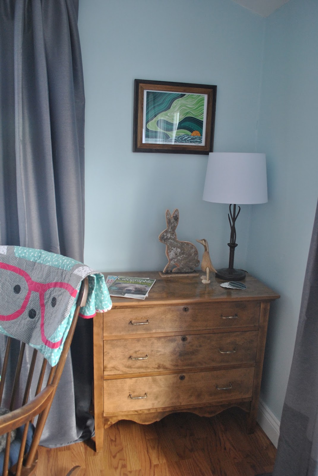
Going with relaxing, beachy vibes, I think a living room is most suitable to incorporate some Florida style. I think my own living room has a beachy feel, so I'm going to pull many elements from it, using pieces that are available here in Canada. For paint, I'd go with my living room choice of Behr's Beach Foam, a pale aqua blue with just a hint of green.


I'd also stick with my white IKEA Hemnes bookshelves and TV stand. The white looks crisp against the blue and brightens the room. Its shelves offer plenty of space for both function and decor. For function, I'd start by finding a spot for my novels, then store papers and magazines in white magazine files and photo boxes. I often find beautifully styled bookcases in magazines unrealistic, as they often don't hold any books! I was happy to find that after moving all of my books, there was still room to display photos and souvenirs from my travels. I'd recommend displaying artwork in brightly coloured frames, whether it's personal snapshots from beach vacations, professional prints or paintings. I would also add some flameless candles, a lantern and maybe souvenirs from travels.


I love these prints by Clare Elsaesser, which you can find on Etsy. She has so many beautiful paintings I'd love to put on my walls. Small prints would look good framed on the bookshelf, while an oversized print or a set of three would look good above the couch.


I'm loving my sectional from the Brick and I think it would fit in a Florida Room as well. This is a different model, but in a similar fabric. The grey serves as the perfect neutral backdrop to brightly coloured quilts and throw pillows. In general, the pale blue, white and grey serve as a nice backdrop to create a calm mood for the room and allow for bright accents - throws, pillows, and other decorative objects.  Having the main pieces in neutral colours also allows you to change up and experiment with different accent colours without costing too much.


Here's a rough example of everything thrown together.


I hope you enjoyed this post. All opinions are my own and I was not compensated for posting. To see photos of my own living room, check out my previous post here. Coming soon, you can expect to see another baby quilt (it's arrived - yay!) and more house projects.

Wednesday 25 May 2016

Nautical Baby Quilt

What's that? This is a sewing blog and I haven't posted a sewing project in a while? Ok Mom, you're right.

A friend of mine had a baby boy in the fall, so of course I had to make a quilt! I went with some anchor and sailboat fabric I picked up in Nova Scotia a couple summers ago and kept the pattern simple. The four patch squares are made from various scraps, so the whole quilt (except for batting) came from my stash.


I loosely quilted some waves to keep the quilting soft.


I've been saving this V & Co chevron ombré fabric for a while now waiting for the right project and it seemed to fit well for this one. I had to add a bit to the bottom and opted for a pop of lime green. I confess I really like this backing combo!


It looks good in my living room too, maybe I should change my colour scheme...ha.

I ended my quilt photo shoot with some play time. I got this mini wooden kayak in Lunenburg and it usually sits on my bookshelves. I was trying to make it look like it was battling waves.


I think this composition is my favourite, though. 


I'm hoping my other baby quilt arrives in the mail soon so I can post it. Until then, happy sewing!


Saturday 9 April 2016

Sights and Sounds

Mornings are usually calm and bright at the lake, but on Easter Sunday it was a bit more colourful than usual. An ice storm on Holy Thursday coated everything in ice - cars, roads, branches and power lines. It also left me without power for 36 hours, which meant no heat, water or electricity. Luckily I had a stocked pantry, flashlights and lanterns, and I was able to haul a pail of water from the lake. In the summer a power outage is no problem at all, but having no heat was a bit inconvenient.

One of the good things that came from the storm, however, were these photos I was able to capture on Sunday morning. I was quietly cooking my breakfast when I noticed the pink sky behind me, so I threw on a coat and boots and headed out with my camera.

Everything was still coated in ice, so that the trees were white, which softened and muted all the colours. The lake was glass, reflecting the sky's colours back to it and as the sun rose, the sky was a living, ever-changing thing, in that way that sunrises have. Fifteen minutes and you might have missed it. No one out but me and the birds, crows and doves and smaller ones chirping and calling.

It made me think of lines from a hymn - Morning has broken, like the first morning. Blackbird has spoken, like the first bird.


Some days you get walloped with an ice storm and other days bring mornings like this.

Friday 8 April 2016

Living Lakeside - Living Room

Over the past few weeks, most of my creative energy and spare time has been spent on home decor. Instead of furnishing beds and backs of couches, I've been working on shelves, walls and floors. Now that most of the work and decor is finished (for now), I'm ready to share some before and after photos. I've always loved a good makeover, so it was exciting to get to do one of my own. After living here for only a few weeks, it's hard to remember what it looked like before. It already feels like home. After looking through this post, I hope you'll forgive the quiet winter on the blog. This is what I was working on.

My house has an open concept living space and the living room flows into the dining area, connected to the kitchen and a countertop bar. French doors replaced the original sliding doors to lead onto a deck. On either side of the doors, on adjacent walls, two big picture windows overlook the deck and the lake beyond.

Blue is my favourite colour and getting to make all the house decisions myself meant that almost the whole place got painted blue! I wanted the space to be light and to take advantage of all the natural light coming in from the big windows. I used Behr Premium Plus Ultra (paint and primer in one). The living room got two coats of Beach Foam while the dining room and kitchen got one shade darker on the paint strip - Sea Wind. I went with white baseboards and trim everywhere, which really brightened the space when combined with the new windows, also framed in white.

Before


After


It's easy to admire carefully styled bookcases in magazines and articles, full of sculptures, frames and vases, but this is real life. Bookcases are also for books. I love to read and own a lot of books, so I needed bookcases that were functional and affordable. I went with Hemnes bookcases and a TV stand from IKEA, choosing two wider units and two narrower units to maximize the space while keeping it symmetrical. I debated going with natural wood and staining them myself, but finally decided on white, to keep the room light. I'm very happy with the choice. For now, an old TV works fine sitting on the stand, but a flat screen secured to the wall will likely replace it in the future.

I admit I was a bit worried while packing up my books that there wouldn't be enough room for them. So I was happily surprised when there was lots of extra space, allowing my collection to grow. I was able to add magazines and other papers in magazine files. Then I even had room for decor, choosing objects and souvenirs that were in my old bedroom, like my music box from Sorrento, my boomerang from Melbourne and a wooden kayak from Lunenburg. A few new flowers in pails and flameless candles completed the shelves.

Before


After


I'm also a big fan of grey and used it for my furniture. It goes well with the blue, matches my cat's hair (ha!) and provides a nice, neutral backdrop for quilts of any colour. (Yes, this was a consideration). I found this sectional at the Brick. There were 21 sections to choose from when creating a sectional and I customized this one a bit by eliminating one of the centre seats so that it would fit the room. This combination has a chaise, an armless chair and a cuddler section that angles towards the lake. I also chose an armchair in matching fabric. My reupholstered ottoman turned out to be the perfect height for the chair. 

Before


After


For lighting, I chose two table lamps and a floor lamp, and a ceiling fan with a light kit is set to replace the existing fan. The lamps work quite nicely in the evenings, but it will be nice to have the overhead light for those grey days. One lamp sits on the trunk I refinished this past summer, while the other sits on the dresser I refinished. Both furniture pieces are stained in Miniwax's Early American. 

To keep the light out, I went with plain white sheers for when I want privacy and two-toned grey blackout curtains for when that morning sun tries to heat up my house in summer. 

Before


After


The living room is long and along with all of the windows and doors, it made sense to put the sectional in the middle of the room. That way, it's a reasonable distance from the TV and doesn't block any windows. The sectional sits close to the right door, but still allows easy access to the other door and a pathway across the room and down the basement stairs. With an area rug and two chairs, I created another sitting space behind the couch, by the window. The rocking chair that came with the house is Oliver's favourite spot, so beware its furry cushion if you're ever over for a visit. The black recliner, passed on to me by new neighbours, also swivels, which I think might be useful when friends are over and I'm cooking dinner. 


I have a feeling that there will be an ever-rotating selection of quilts in this room. I've already moved them around since these photos were taken. Front and centre, though, is a new pattern I designed that will be released soon, called Ocean Sky. It's my first quilt made entirely of batiks and I picked out the fabrics months ago, long before this room was put together. I must have clearly defined tastes. I had enough scraps to make pillow covers and inspired by Johanna's pillows, went with Alyce's Tic Tac Toe block. The block style matches the quilt design well.  


Anja was one of my pattern testers for Ocean Sky and you can see her version on her blog.

I hope you enjoyed the living room tour. I've got a few more rooms to show you in the upcoming weeks, along with a few baby quilts, the Ocean Sky pattern and other little things.

Happy creating!

Linking up with Can I Get a Whoop Whoop and Fabric Frenzy Friday.


Friday 25 March 2016

Oven Mitts

I never seem to be short of inspiration for new projects. Rather, like most quilters, I've got far too many ideas and not enough time. That goes along with far too much fabric I'd like to buy and not enough money. Lately though, I've been trying to sew a bit more for function rather than art.

By the time I finish the couple I have in progress, I will have made ten quilts four myself. Four of those are bed-sized and six throw-sized. So it made sense to me to focus on other projects for a bit and having recently bought my own house, I decided some more house projects were in order. I write more because I started making things for my house long before I got it, way back to last summer.

There was the Patchwork Bench from Anna Graham's book Handmade Style.


I refinished an old dresser from the attic and a trunk found at yard sale.


Then I sanded, stained and recovered these sling deck chairs.


Pair those with the quilts and the addition of the ottoman, and I was off to a good start.


Today I want to share the oven mitts I made a couple of weeks ago. I found several tutorials online and went with this one by Heather from Quilts Actually.


For the main fabric, I chose some fabric I've had in my stash for a while but couldn't seem to find a project for. The design on the print has worked out perfectly for oven mitts and matches my light blue kitchen nicely. I used fabrics from the Botanics line for the accent strip, binding and lining - some green on white stripes and a floral grid.


I sandwiched two layers of batting and a layer of Insul-brite between my fabrics and quilted them with randomly spaced organic lines. Not worrying about keeping my lines even was both stressful and freeing. I wanted them to be wavy enough so that you could tell they were intentional but straight enough to be horizontal. While stitching them, I would deliberately look at the television and keep my foot on the pedal, just because I could.

I traced and cut the oven mitts out of my two pieces, then sewed them right sides together. The dense quilting made the oven mitt panels pretty flat, but even after notching the curves, I still had difficulty turning the thumbs right-sides out. For the second mitt, I ended up shortening my stitch length to make sure the edges of the fabric wouldn't pull through on the notches. I was much happier with the result on the second mitt.

Binding the cuff was a bit of a challenge as well, but I really like how it sets off the accent strip and finishes off the oven mitts.


I was left with oddly shaped scraps from the panel I quilted and it felt wasteful to throw them out. So I traced some circles to cut out a set of 4 coasters. I didn't feel like binding them, so I used a zig zag stitch around the perimeter and left them raw edged. From some of the bigger sections of the panel, I cut out rectangles with rounded corners. I added two pieces of fabric, each folded in half, to the back. I used a zig zag stitch again around the outside, this time making those little finger oven mitts you can use to grab light baking sheets from the oven or dishes from the microwave.


Finally, to use the last of the scraps, I cut small rectangles and improv pieced them together to make a hot pad. I increased my stitch width for this, and where they didn't catch, I just went back and stitched over them. The more I stitched, the cooler it looked. I would definitely do this again. I think it would be fun to try different shapes, making stars and hexagons out of already quilted scraps.


I've used all of these a couple times already and they work fine. I've got pretty oven mitts, used some of my stash and didn't have to buy anything new. A win-win.


More to come :)

Linking up with Fabric Frenzy Friday, Finish it up Friday, TGIFF and Can I Get a Whoop Whoop.

Oh, and you should really go check out TGIFF, hosted by Anja this week, who's posting her Ocean Sky quilt - one of my patterns in progress. Its release got delayed by my house, but now that my version is sitting on the back of my couch, I need to get photos and get it out there!